District Demographics
The City of San Antonio is made up of 10 City Council Districts. Find out which City Council District you call home and explore the characteristics of all 10 below.
SA2020’s City Council profiles disaggregate community data by geography. Doing so offers a deeper understanding of San Antonio’s progress, long-standing inequities, and the targeted, race-conscious interventions necessary to reach the shared Community Vision.
Note: In 2022, following the 2020 Census, San Antonio City Council approved new district boundaries that went into effect following the May 2023 election. Unless otherwise noted, SA2020’s City Council data uses the new district boundaries.
The City of San Antonio is made up of 10 City Council Districts. Find out which City Council District you call home and explore the characteristics of all 10 below.
Making sense of San Antonio’s progress and inequities requires first learning about the history of redlining. This map recreates the “residential security maps” or redlining maps created in 1935 by the federal government to subsidize housing for White people and discriminate against people of color.
Grade A: neighborhoods shaded in green, “the best” for investments
Grade B: neighborhoods shaded in blue, “still desirable”
Grade C: neighborhoods shaded in yellow, “definitely declining”
Grade D: neighborhoods shaded in red, “hazardous”
Note: To zoom in and out and interact with the information further, visit SA2020’s public Tableau.
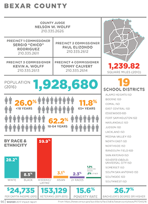
These maps and charts show select community indicators by City Council District. To see more data, download the full report.
Note: Visit this webpage on desktop to see additional views and more detail.
Thank you to Mapping Inequality, a project of the University of Richmond’s Digital Scholarship Lab, Virginia Tech, the University of Maryland, and the Johns Hopkins University, for making San Antonio’s redlining maps available for digital download. The original map scan is from UTSA Special Collections.
In May 2022, the City of San Antonio Department of Information Technology Services, GIS Unit provided the overlays of precinct IDs and census tracts for the ten City Council Districts and those outside the City of San Antonio boundaries. The tracts and precincts note intersecting acreage across Council Districts, precincts, and census tracts by percentage.
For voter data, SA2020 used the precinct overlays and percentages aligned to Council Districts in 2021 and 2022. Bexar County Elections Data by precinct was then calculated for the November 2022 Midterm Election and the May 2021 Municipal Election. For all census data, SA2020 used the census tract overlays and percentages that align to the approved new district boundaries that go into effect after the May 2023 election. Bexar County Census Tracts from the US Census Data, American Community Survey 5-Year estimates from 2021 was then calculated for all other data on this page. SA2020 used these percentages to disaggregate indicators by Council District. This assumes population is evenly distributed across acreage. In instances where percentages do not add up to 100%, it is due to rounding.
The 5-year estimates from the ACS are estimates that represent data collected over a 60-month period. Because the ACS is based on a sample, ACS estimates have a degree of uncertainty associated with them, called sampling (or margin of) error. The primary advantage of using multiyear estimates is the increased statistical reliability of the data for less populated areas and small population subgroups. SA2020 uses 5-year estimates because we are examining census tracts aligned to Council Districts. For more information on using ACS data, see Understanding and Using American Survey Data: What All Data Users Need to Know.
When we can’t measure all of something, like people in a city, we sample them—measure only some to get an idea (estimate) of what’s true for everyone. Sampling introduces error and uncertainty, and the margin of error—for example, “plus or minus three percentage points”— is a measure of how much uncertainty there is. The smaller the sample in relation to the total population, generally, the larger the margin of error. (Source: Alamo Regional Data Alliance)
Download the profile of an individual Council District or the full report, showing data for the City of San Antonio, Bexar County, and all 10 Council Districts.
SA2020 has also made the raw data available. Download the data for each indicator, City Council District, the City of San Antonio, and Bexar County. We invite you to further ask critical questions, inform research, and create visualizations.
From 1935-1936, the federal government surveyed San Antonio’s neighborhoods and assigned grades “A,” “B,””C,” and “D” to indicate the security or risk of investing. Grades, shaded on a map in green, blue, yellow, and red indicated “best,” “still desirable,” “definitely declining,” and “hazardous.” The red-lining maps explicitly considered and detailed the population of neighborhoods by race.
For decades, this information was used by banks and mortgage lenders to subsidize home ownership for White people and deny people of color home ownership. Redlining was outlawed in 1968 through the Fair Housing Act, but its legacy remains oppressive.
In addition to building generational wealth, a safe home is directly tied to people’s health and well-being. The relationship between the value of homes in a neighborhood, property taxes, and school funding, is just one example of the legacy of redlining and the racial disparities in San Antonio’s education outcomes today.
Without this context, disaggregated data supports harmful narratives that blame individuals for long-standing inequities. The truth reveals the power and responsibility of institutions.
After 12 years of driving progress toward a shared community vision, SA2020, the nonprofit organization, is dissolving. We believe this is the most visionary thing we can do. We made this decision with the greatest care for our organizational values of leadership, community, and accountability, and we hope you’ll read more about it on our blog.
Our website is live with our final data release, showing where San Antonio stands on reaching the shared community vision. The data release is accompanied by our final call to action—a policy agenda for City government based on our unique bird’s-eye view of San Antonio.
While SA2020’s operations ended March 28, these resources, along with the last twelve years of our research and stories, will be available to download from our website through September 2024.
– Team SA2020